Discrimination of data with PLS-DA
The PLS regression method, described in the previous chapter, can also be used for classification (or, more precise, discrimination) of multivariate data. The general idea is rather simple:
- Use a categorical binary variable, which have values +1 for objects, belonging to a particular class, and –1 for objects, which are not from the class, as a response in calibration and validation sets.
- Create a PLS-regression model as usual, using the response values defined above.
- Make predictions. If a predicted response value is above or equal to 0, the corresponding object is considered to be a member of the class. If not, the object is rejected as a non-member.
So, in fact, PLS-DA is a PLS with an extra step — classification by using a threshold for predicted y-values. It means that a PLS-DA model as well as PLS-DA results inherit all methods and properties from the conventional PLS objects. In this chapter we will therefore focus on the extra options and methods, available exclusively for PLS-DA. Most of them are actually available for any other classification method (e.g. SIMCA).
It must be noted that PLS-DA in general supports multiclass classification, when one provides the binary values in several columns (one for each class). However, it is not recommended to do this (see e.g. an explanation here). In this case it is better to create several one-class PLS-DA models instead of one for multiple classes.
Calibration of PLS-DA model
The biggest difference from PLS here is how to provide proper values for responses. There are two possibilities. First, is to use a dataset with single factor column and specify either a level number or a label for the level as a class name. Second, is to provide a vector with logical values (true for class members and false for non-members) and a class name. In the code below we create PLS-DA models for discrimination between Scandinavians and the others (in our case Mediterraneans, since we do not have any other regions) in the People data by using these two ways.
First we need to load the dataset.
load('people')
Here is how to create the model using factors
X = copy(people);
X.removecols(:, 'Region');

c = people('Region');
c.factor(1, {'A', 'B'});

m1 = mdaplsda(X, c, 'A', 3, 'Scale', 'on');
And here how to do the same using logical values.
X = copy(people);
X.removecols('Region');

c = people(:, 'Region') == -1;

m2 = mdaplsda(X, c, 'A', 3, 'Scale', 'on');
The result will be absolutely the same. It makes sense to use the first way if a factor is already exists and contains several levels (and level names). In this case it is important that the provided class name is identical to one of the level names.
Exploring PLS-DA results
As it was mentioned already, both model and result objects have all methods and properties inherited from corresponding PLS object and then a bit on top of them. Let us look at the differences for the result object first.
In addition to an array with predicted response valyes, ypred, in PLS-DA result object there is also an array with predicted class values, cpred. In the example below we show both values for the case when three components were used in the model (we will use m1 calculated using the code above).
show([m1.calres.ypred(1:end, 1, 3) m1.calres.cpred(1:end, 1, 3)])
Responses
                 A  VA
           ------- ---
      Lars    1.07   1
     Peter   0.676   1
    Rasmus    0.51   1
      Lene   0.939   1
     Mette    1.01   1
     Gitte    1.12   1
      Jens    1.19   1
      Erik    1.18   1
     Lotte   0.886   1
     Heidi   0.921   1
       Kaj    1.35   1
     Gerda   0.772   1
      Anne   0.445   1
    Britta   0.609   1
    Magnus    0.95   1
    Casper   0.972   1
      Luka  -0.695  -1
  Federico  -0.716  -1
      Dona  -0.653  -1
  Fabrizia   -1.59  -1
      Lisa  -0.488  -1
    Benito  -0.927  -1
    Franko   -1.03  -1
Alessandro  -0.915  -1
   Leonora  -0.449  -1
  Giuliana  -0.769  -1
  Giovanni   -1.02  -1
  Leonardo   -1.14  -1
     Marta  -0.539  -1
   Rosetta   -1.13  -1
     Romeo   -1.38  -1
    Romina   -1.17  -1
As one can see all negative predictions were classified as –1 and all positive as +1. The performance statistics of any classification model is including the following values:
| Name | Description |
|---|---|
| FN | Number of false negatives (class members that were incorrectly rejected by a model). |
| TN | Number of true negatives (non-members that were correctly rejected by a model). |
| FP | Number of false positives (non-members that were incorrectly accepted by a model). |
| TP | Number of true positives (class members that were correctly accepted by a model). |
| Sensitivity | TP / (TP + FN). |
| Specificity | TN / (FP + TN). |
| Misclassified | (FN + FP) / (FN + TN + FP + TP). |
All statistics are stored in the same structure as for PLS.
disp(m1.calres.stat)
             rmse: [3x1 mdadata]
             bias: [3x1 mdadata]
            slope: [3x1 mdadata]
               r2: [3x1 mdadata]
              rpd: [3x1 mdadata]
               fp: [3x1 mdadata]
               fn: [3x1 mdadata]
               tp: [3x1 mdadata]
      sensitivity: [3x1 mdadata]
      specificity: [3x1 mdadata]
    misclassified: [3x1 mdadata]
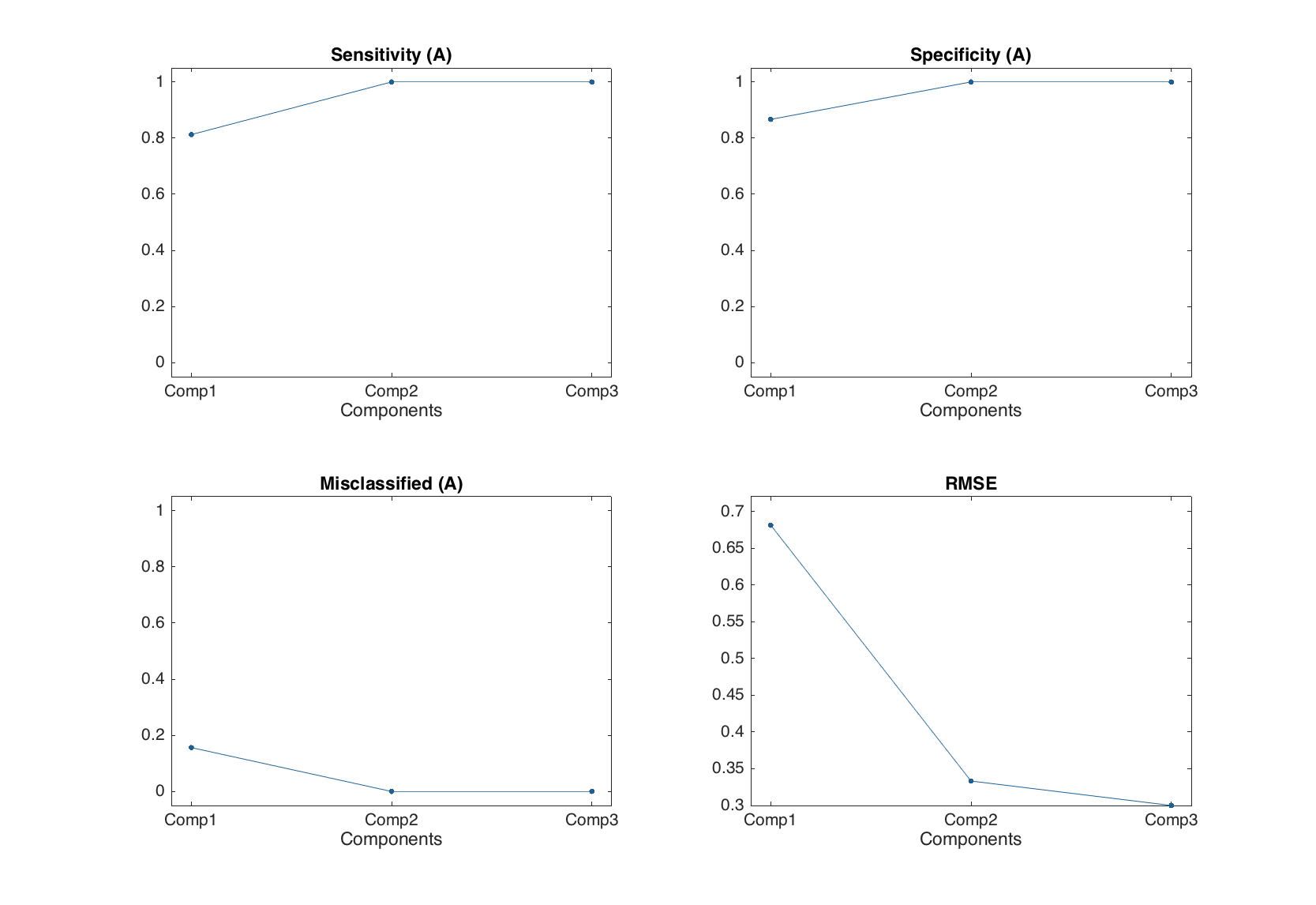
And these values complement the conventional PLS performance statistics, such as RMSE, bias and so on. The function summary() shows the classification statistics for all components used in the model.
summary(m1)
Results for calibration set

Classification performance for A:
        X expvar  Y expvar  FN  FP   Sens   Spec    Mis
       --------- --------- --- --- ------ ------ ------
Comp 1        44        55   3   2  0.812  0.867  0.156
Comp 2      26.3      34.2   0   0      1      1      0
Comp 3      12.7      2.04   0   0      1      1      0
So one can see that with two components the classification performance for calibration set was already good enough.
There are also several additional plots for PLS-DA results (and actually for any other object containg result from a classification method).
| Method | Description |
|---|---|
plotclassification(obj, ...) |
Classification plot. |
plotmisclassified(obj, ...) |
Ratio of misclassified objects vs. number of components. |
plotsensitivity(obj, ...) |
Sensitivity vs. number of components. |
plotspecificity(obj, ...) |
Specificity vs. number of components. |
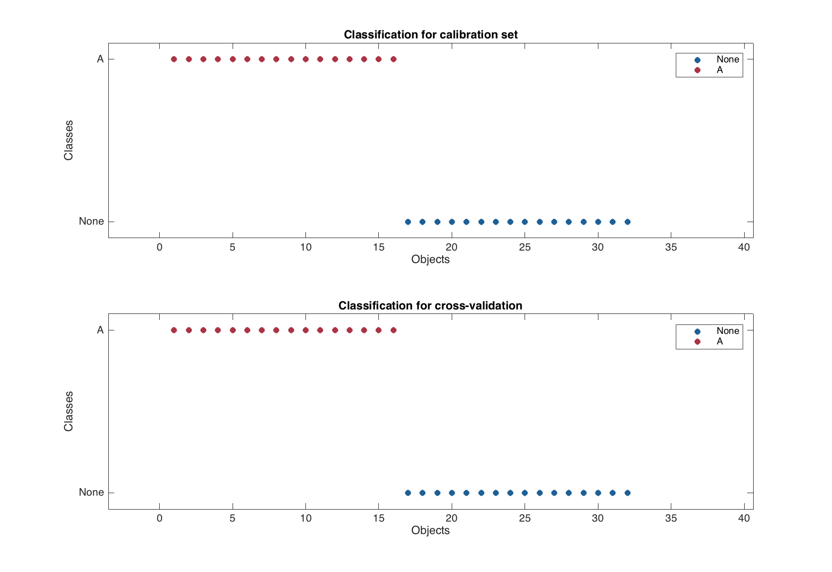
The classification plot shows results of classification using color grouped scatter plot and can be tuned correspondingly. Similar to the plotprediction() one can specify number of response variable (in this case always 1 as we have one class classifier) and number of components to show the classification results for. Here are some examples.
figure

% default
subplot 221
plotclassification(m1.calres)

% for first response (class) and first component
subplot 222
plotclassification(m1.calres, 1, 1)

% with additional settings
subplot 223
plotclassification(m1.calres, 'Color', 'rg', 'Marker', 'ds')

% PLS predictions
subplot 224
plotpredictions(m1.calres)
line(xlim(), [0 0], 'Color', 'k')
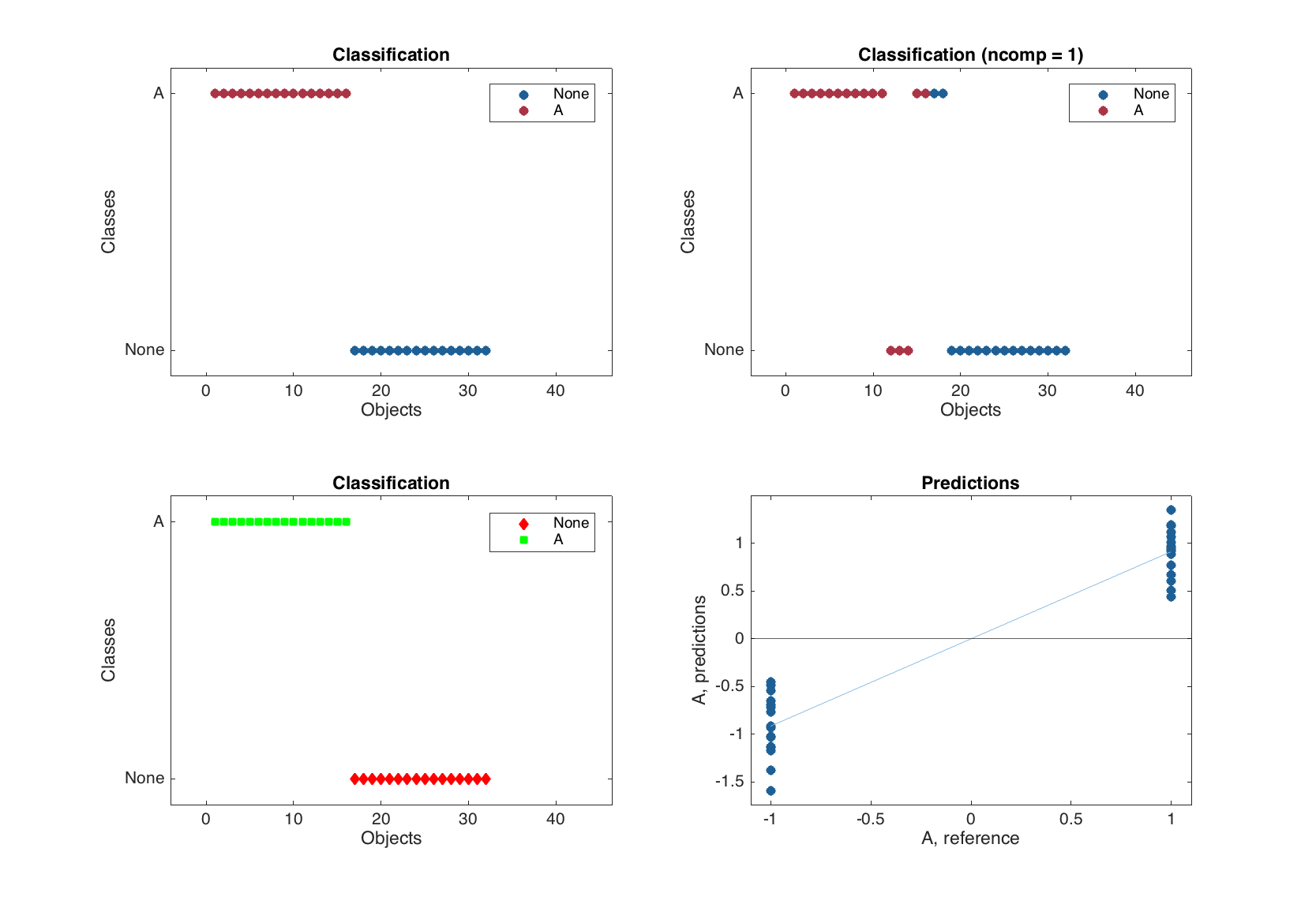
The bottom right plot in the figure above is a normal PLS predictions plot with added horizontal line, which corresponds to the threshold used for classification.
The other three plots mentioned in the table, show the corresponding statistics depending on number of components in PLS-DA model, similar to e.g. plotrmse() in PLS. As it was already mentioned and also shown in the example below, the conventional PLS plots are also available.
figure
subplot 221
plotsensitivity(m1.classres)
subplot 222
plotspecificity(m1.classres)
subplot 223
plotmisclassified(m1.classres)
subplot 224
plotrmse(m1.classres)
Exploring PLS-DA models
Again, similar to PLS, the methods for PLS-DA model just show values, statistics and plots for each of the results available (calibration, cross-validation and test set). Let us calculate a model with full cross-validation and make some plots as an example.
m = mdaplsda(X, c, 'A', 3, 'Scale', 'on', 'CV', {'full'});

figure
subplot 221
plotsensitivity(m)
subplot 222
plotspecificity(m1)
subplot 223
plotmisclassified(m)
subplot 224
plotrmse(m)
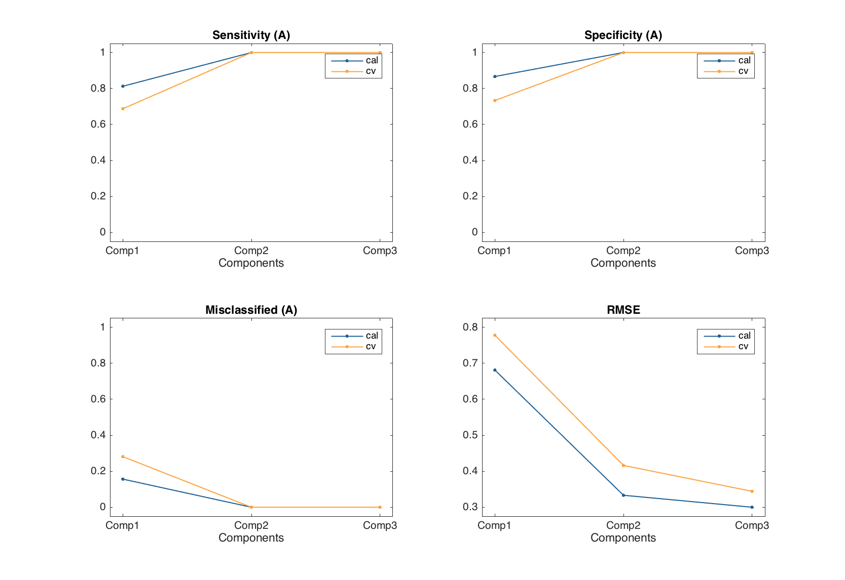
There is, however, one difference. Since the color grouping is already used in classification plot to show difference between class members and non-members, the classification plot for PLS-DA model is represented by several separate plots for each of the available results.
figure
plotclassification(m)
The test set validation works similar to the PLS, one just have to provide a factor or a vector with logical values as response value for 'TestSet' parameter (similar to what we did in the beginning of this chapter for calibration set).
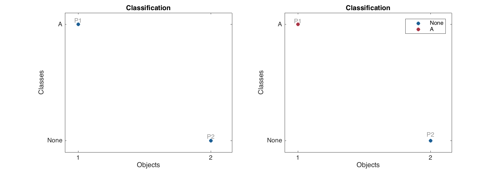
Classification of new objects
Making predictions for new objects works similar to PLS.
% define values for two "new" persons
p1 = [181 82 -1 42 35 35000 320 100 -1 90 120];
p2 = [179 76 -1 42 43 19000 185 180 -1 85 120];

% create a dataset
p = mdadata([p1; p2], {'P1', 'P2'}, X.colNames);

% make predictions without reference values
res1 = m.predict(p);

% make predictions with reference values
res2 = m.predict(p, [true; false]);

% show results
figure
subplot 121
plotclassification(res1, 'Labels', 'names')
subplot 122
plotclassification(res2, 'Labels', 'names')